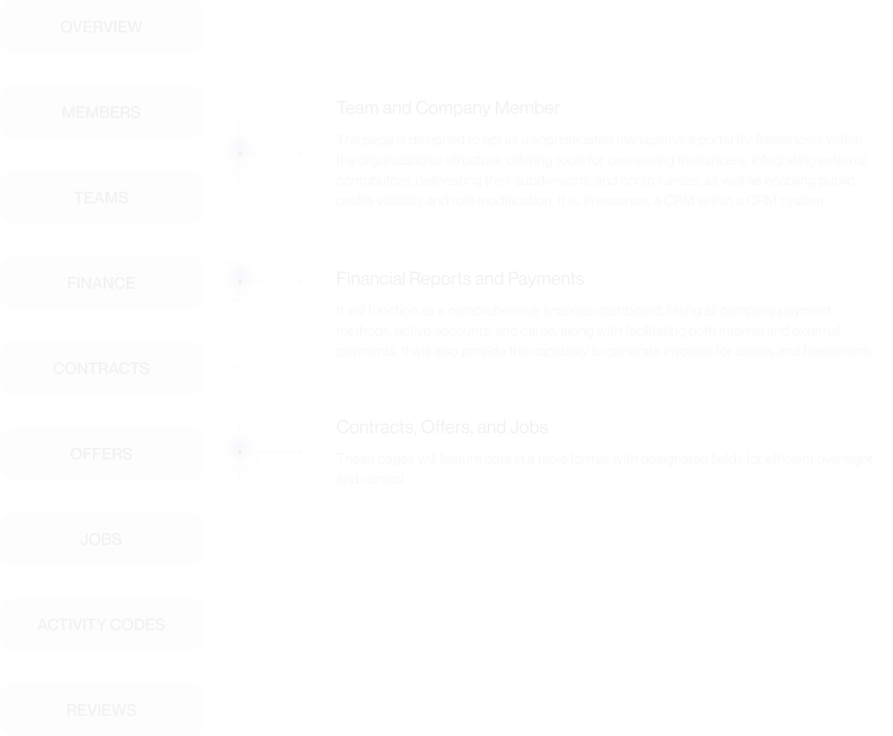
A freelance marketplace where companies could not see their contractors or their money. I led design on the company management module, rebuilt the navigation, and built the design system.
goLance competed with Upwork and Fiverr for the same customer: a company that hires a team rather than one freelancer. It kept losing them at the same point. Once a company had signed a few contracts, it had no way to see its own people or its own spending.
Matching a client with a freelancer worked well. Everything after the hire did not. Who is working on what, how much we spent this month, where the contract is: all of it sat in tables spread across different sections. A company with twenty contractors was using an interface built for someone with one.
The platform had a big and fairly loud community, so we did not have to guess much. We talked to people who ran into this every day and read what they sent to support.
Why is it so hard to get a financial report? I spend most of my time just looking for the numbers.
Rajesh K. · clientI can't track what my freelancers are doing, and I keep making mistakes when I add them or change their roles.
Ethan R. · clientI can't find the documents I need. Everything gets lost between too many tabs.
Elena H. · clientThere were three designers on this project. Here is where my work ended and theirs began, because without that line a case study says nothing.
A live marketplace moving real money is not a blank canvas. The walls we had:
Three forks where this project could have gone the other way.
Clients asked for "freelancer management". We already had contract tables, so adding filters and roles to them was fast, cheap and close to risk-free. Building a management hub from scratch was slow, expensive, and could easily miss what people actually needed.
Once a company has twenty contractors, access stops being a detail. Show the balance to everybody and you have a leak, plus arguments inside the client's own team. Show it only to the owner and the owner has to approve every small thing.


New features do not help if people cannot reach the old ones. Users complained about duplicate links, pages doing the same job, and a long walk to their reports. Rewriting navigation on a live marketplace is risky though. People have already learned the old one, and you pay for the change in confusion and support tickets.


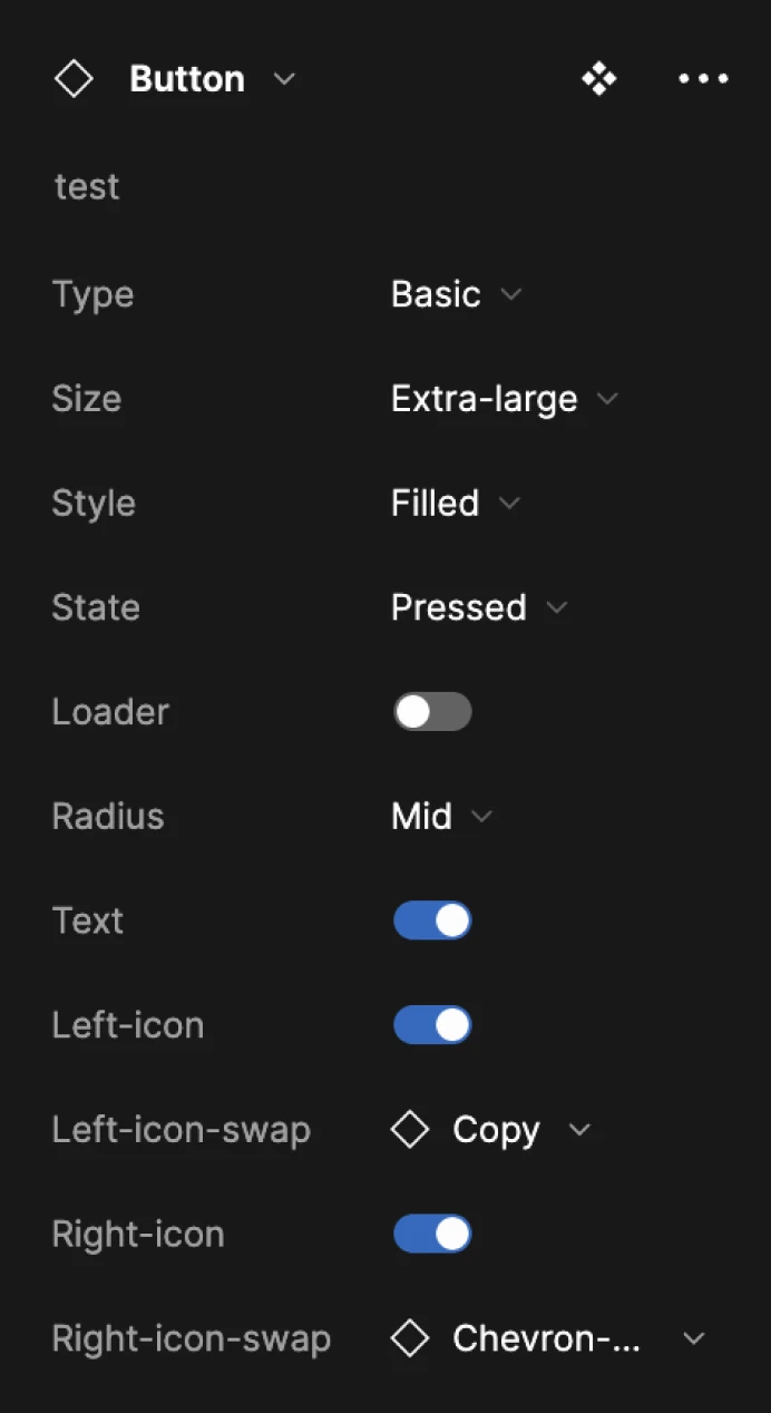
Built from zero, and not just for this module. Every component was drawn in all of its states: default, hover, disabled, focus, pressed, loading. Most of the work in a component library sits in the states, not in the screen where everything goes right.


Numbers from Amplitude and support tickets, three months after launch. The usability figures come from two rounds of testing with 8 participants.
Three-month retention for companies went from 66% to 68%. Two points. Over three months that could be seasonality, marketing, or one of the other releases, and I am not going to pretend design did it. What is interesting is that most of the increase sat with companies that actually used the dashboard. That is a hypothesis, not proof. It is what I would have tested next.
One result no metric really captures: two other products at the client took the 40-component system and changed nothing but the styles.